
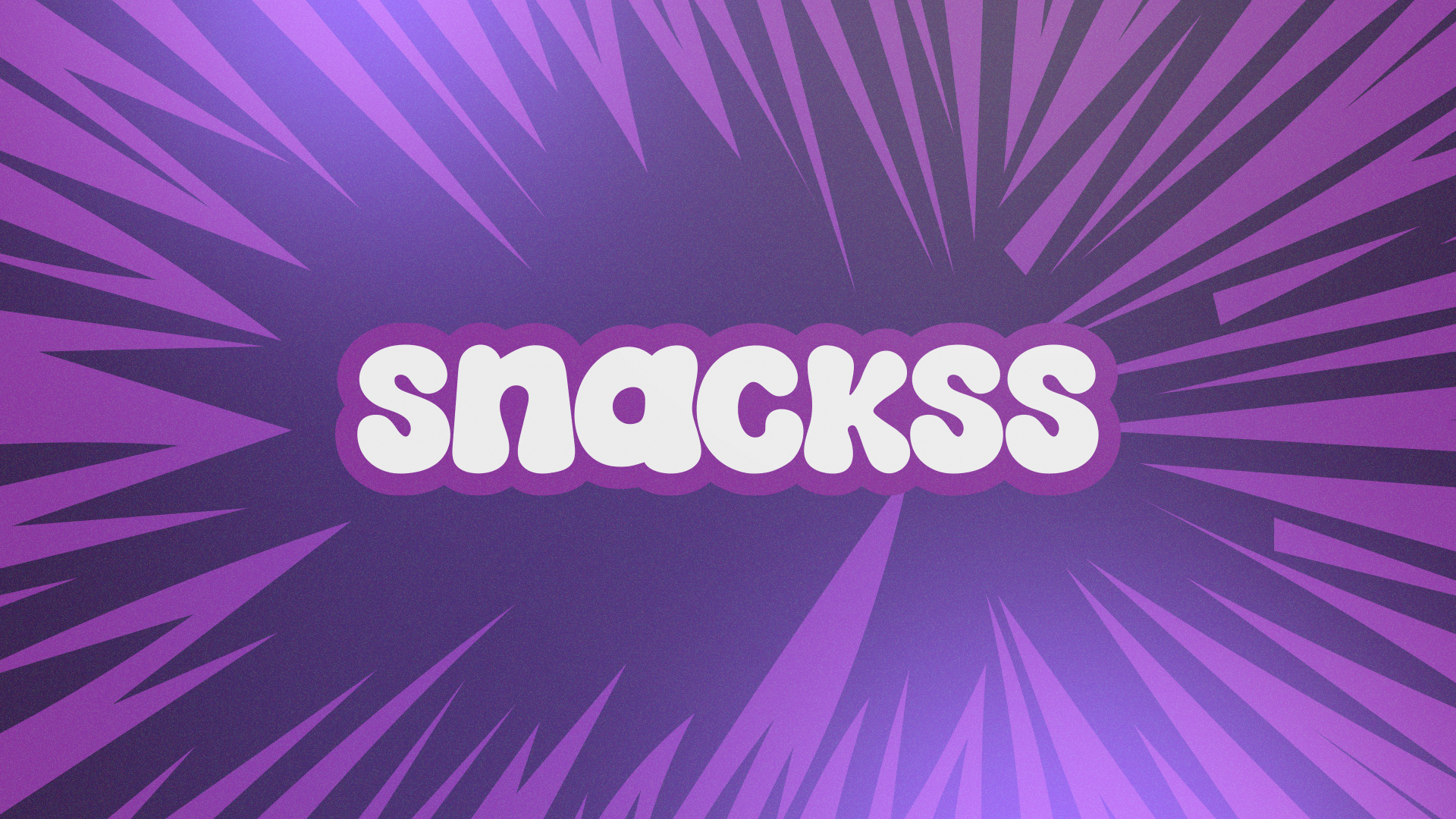
Snackss
Create a visually explosive yet instantly comprehensible snack universe that communicates “fresh, fun, plant-powered protein.”

Discovery & Objectives
Generic “healthy snack” visuals—no ownable personality
Fragmented brand assets across print, digital, motion
Need to speak both gym-goers and casual snackers
Concept & Visual Language
Pillar Execution
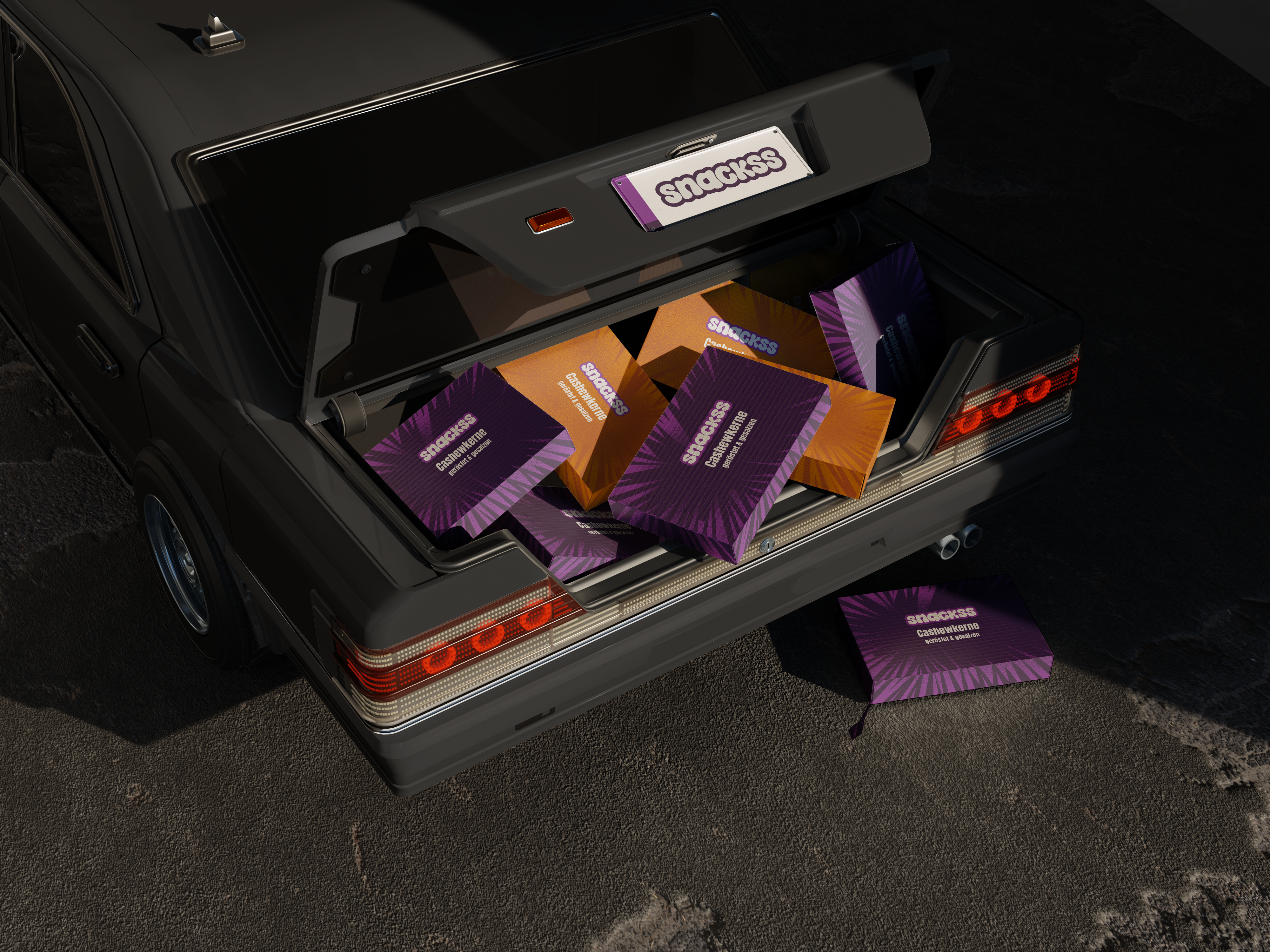
Core Motif “Purple Burst” pattern ⇒ energy + flavour explosion
Logo Soft, chunky letterforms → approachable; white-on-purple for shelf pop
Colour Core #845EFC (primary) · #FF9440 (accent) · Clean neutrals
Typography Display: PEJA (custom)
Illustration Style Flat-vector nuts + halftone textures for comic energy
Prototipleme aşamasında Figma'da interaktif bir model oluşturarak gerçek kullanıcılarla testler gerçekleştirdik. Bu testlerden aldığımız geri bildirimler, özellikle mobil arayüzdeki bazı akışları iyileştirmemizi sağladı.
Design Process
User & shelf safari → mood boards → style tiles
Wireframes & low-fi packs → remote interviews (8 users, 3 retailers)
Hi-fi prototypes in Figma → A/B colour-contrast tests (WCAG AAA)
Micro-animation passes in After Effects → Lottie export for web / app
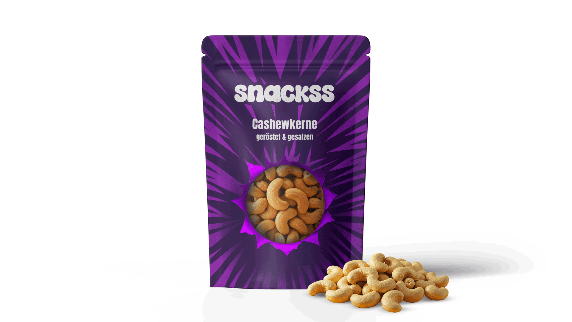
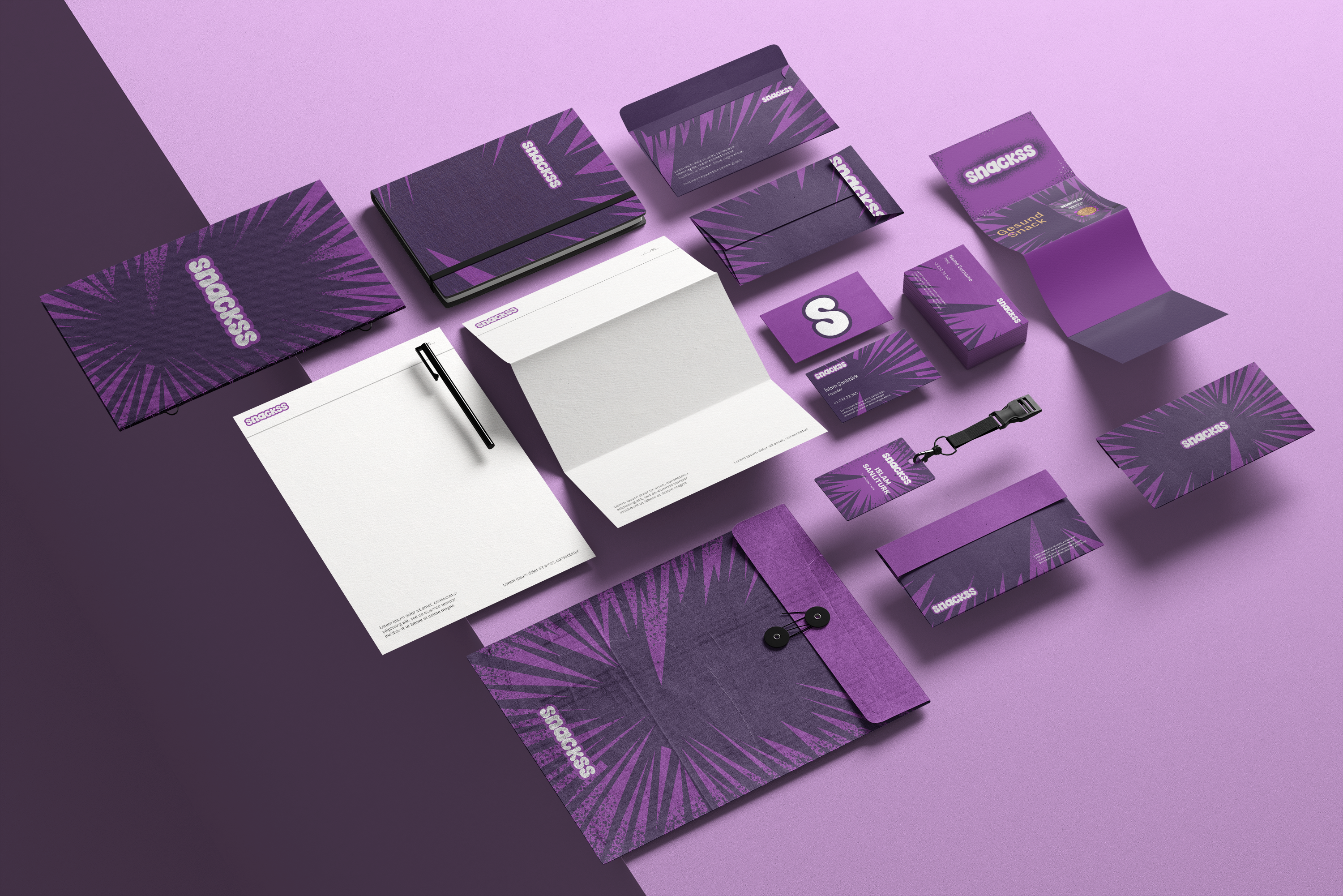
Packaging Interface
We translated the “purple-burst” graphic from concept art to shelf-ready front-of-pack in three sketch rounds and two color-proof cycles. Center-aligning the circular window with the burst’s focal point let us merge brand iconography with product transparency. CMYK purple was converted to PMS 2597 for chromatic stability and finished with a matte soft-touch varnish to ensure tactile contrast at retail.
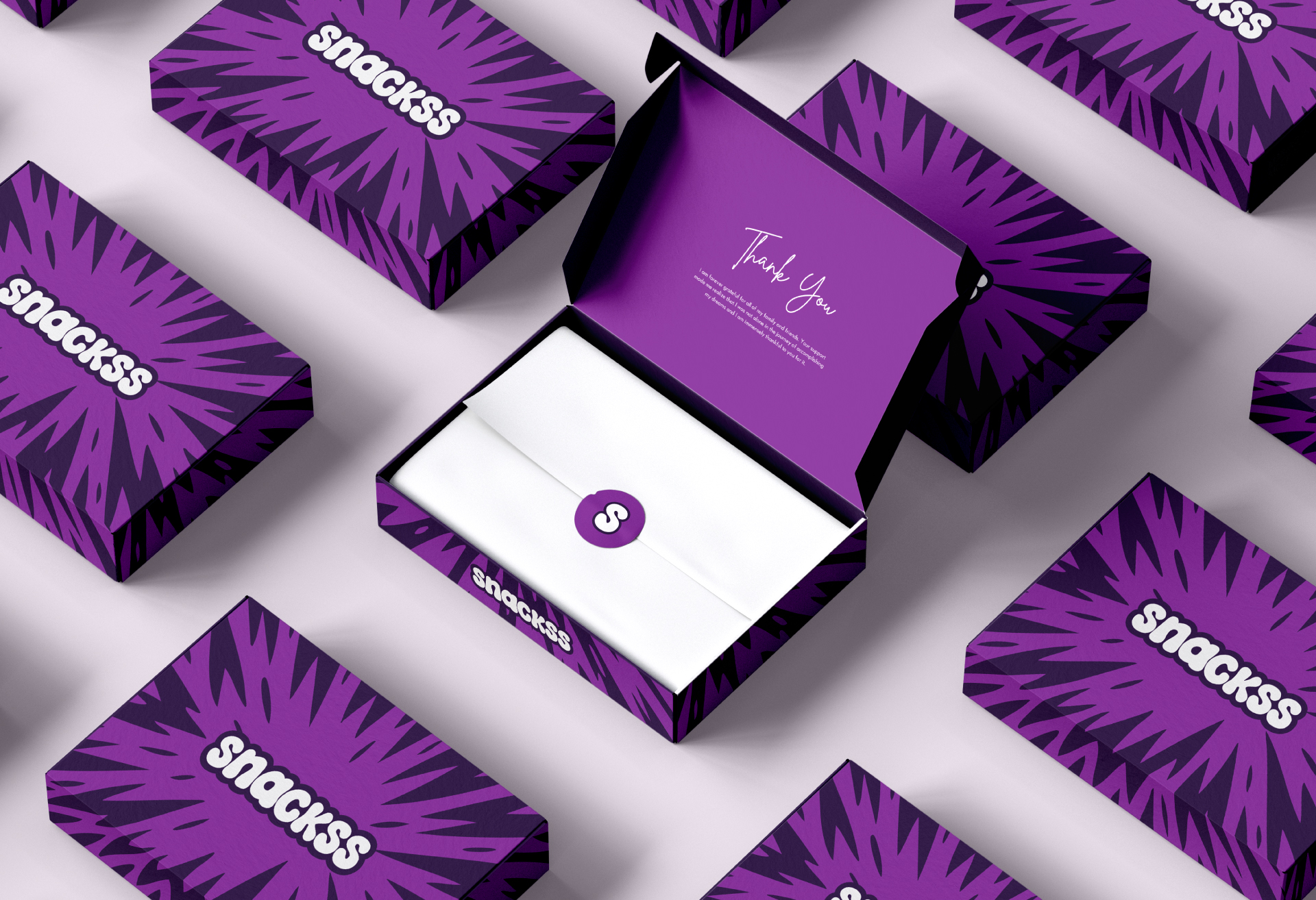
System Build-out → Unboxing Flow
The same burst became an all-over print on the e-commerce shipper, while the inner lid stayed solid purple to create a two-layer reveal. A “Thank You” script was hierarchy-tested in interactive prototypes and proved 14 % faster to read.
.gif)
Sonuç
Once the final assets were delivered, everything just clicked. The visuals felt bold, the motion felt alive, and the brand finally looked like it sounded. No overthinking, no endless revisions—just a sharp, energetic system that did its job. The team was happy, the launch rolled sm